CJM Translations
Design Process:
From Ideation to Completion
This project was a overhaul of CJM Translations visual language and branding to create a cohesive brand identity.
The design needed to communicate accuracy, professionalism and efficiency, as well of the nature of the service provided by the company. CJM Translations participates in mainly certified translation of legal documentation from English into Spanish.
Steering away from the classic and stereotypical translation logos was important for the client.
Inspiration
My starting point in this project was to find a fusion point between “translation” and “legal” visual languages.
I found reference material that incorporated the clean and minimal style common in legal branding, but steered away for the more formal, serif logos to keep the approachability of more traditional translation logos.
By finding inspiration that used the visual principles that I felt communicated CJM Translations brand and used techniques that I could apply to a new concept, I could focus on the next step of translating the brand values and services into motifs and imagery.
Final Concept
The new visual identity for CJM Translations displays professionalism, accuracy and efficiency, and blends the visual languages of both legal and translation branding.
Application
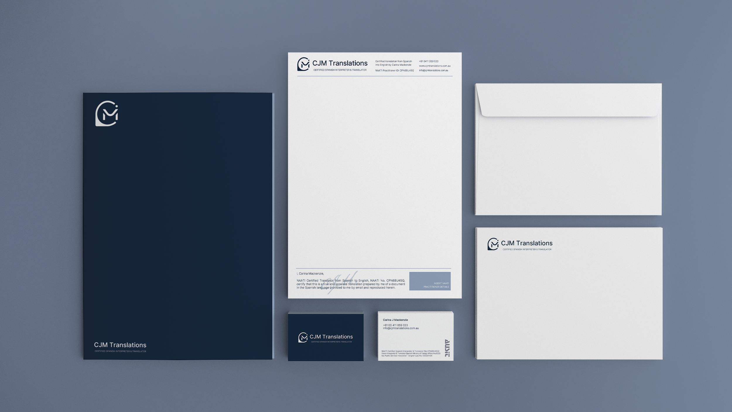
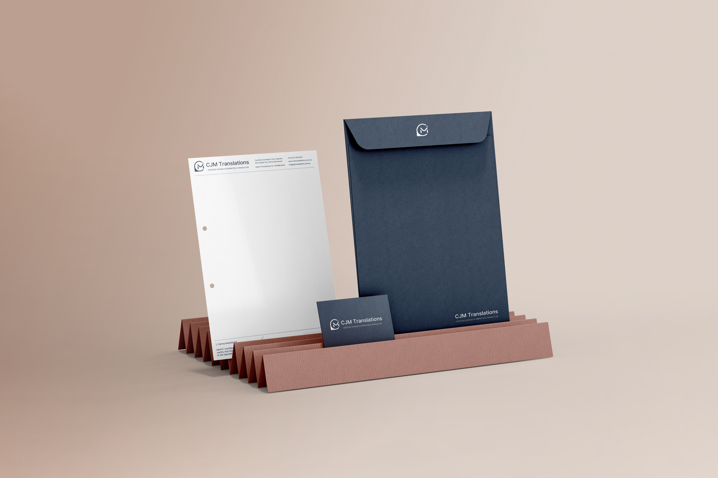
CJM Translations’ new visual identity was applied to a number of commonly used touch points, including letter heads, business cards and a new email signature that ensure consistency across the brand.