Digi Grotesk Zine

Design Process:

From Ideation to Completion

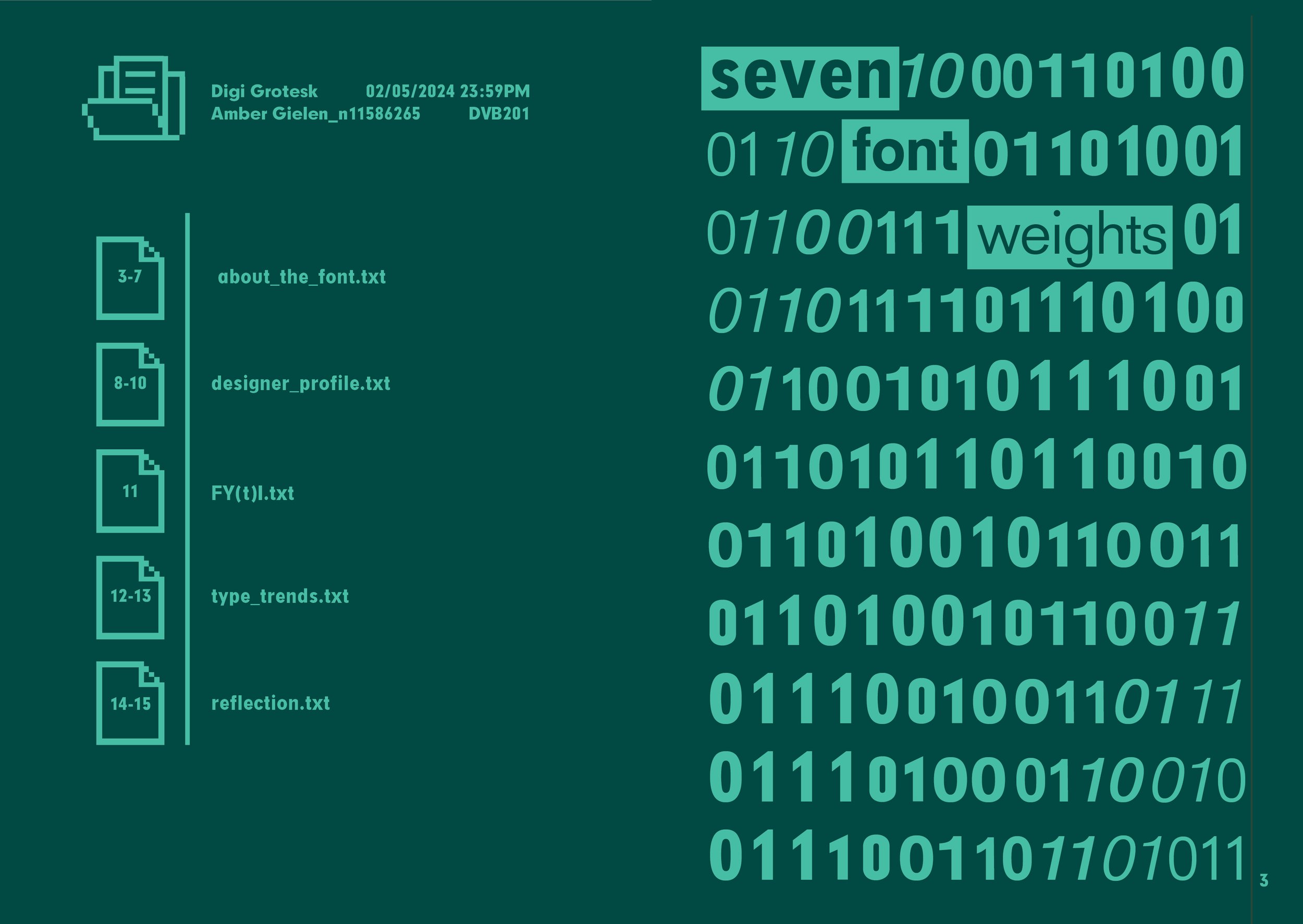
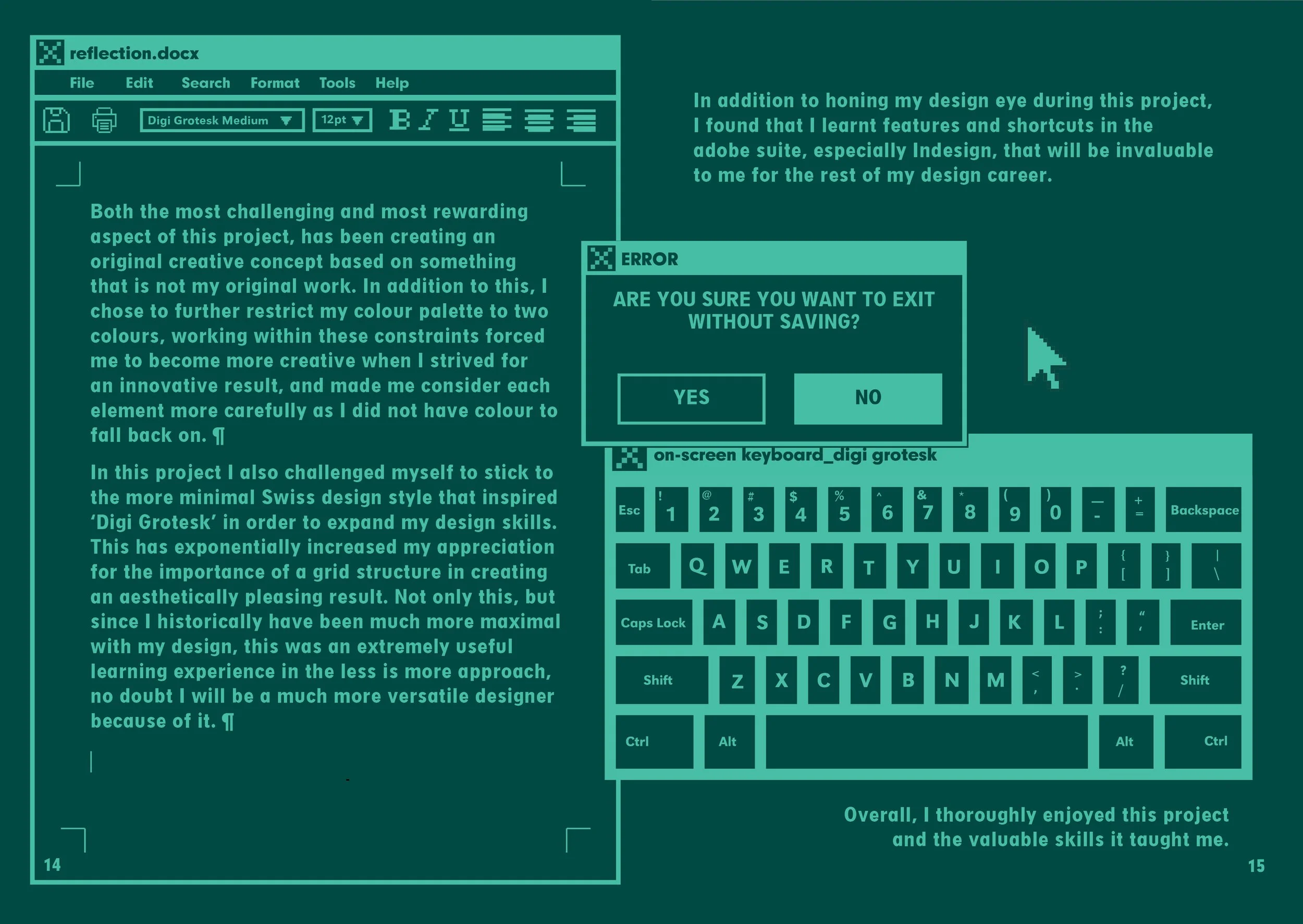
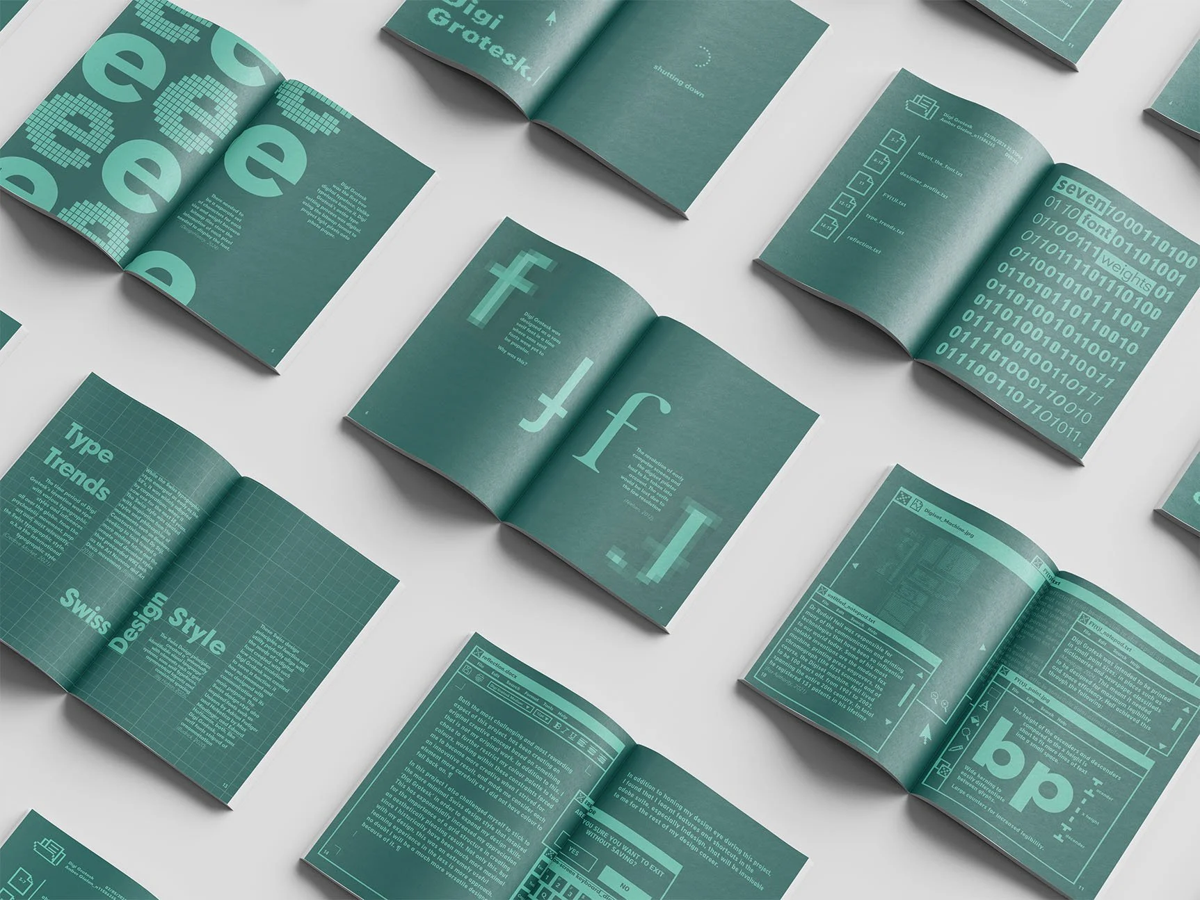
The brief for this project was broad, leaving me liberty to stretch my creative muscles. The task was to create a 16 page A5 typographic zine using only two colours.

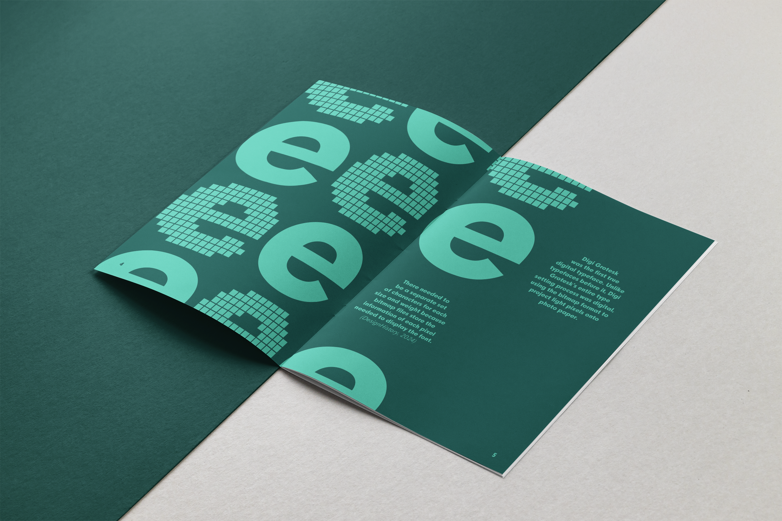
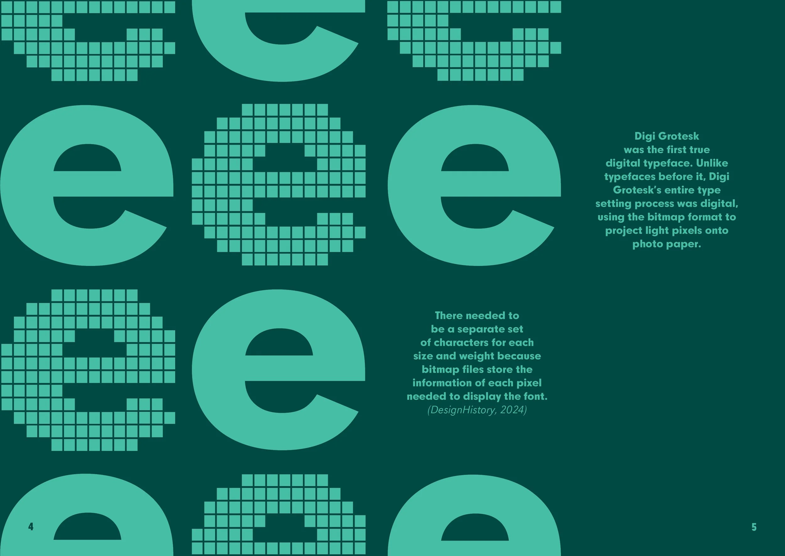
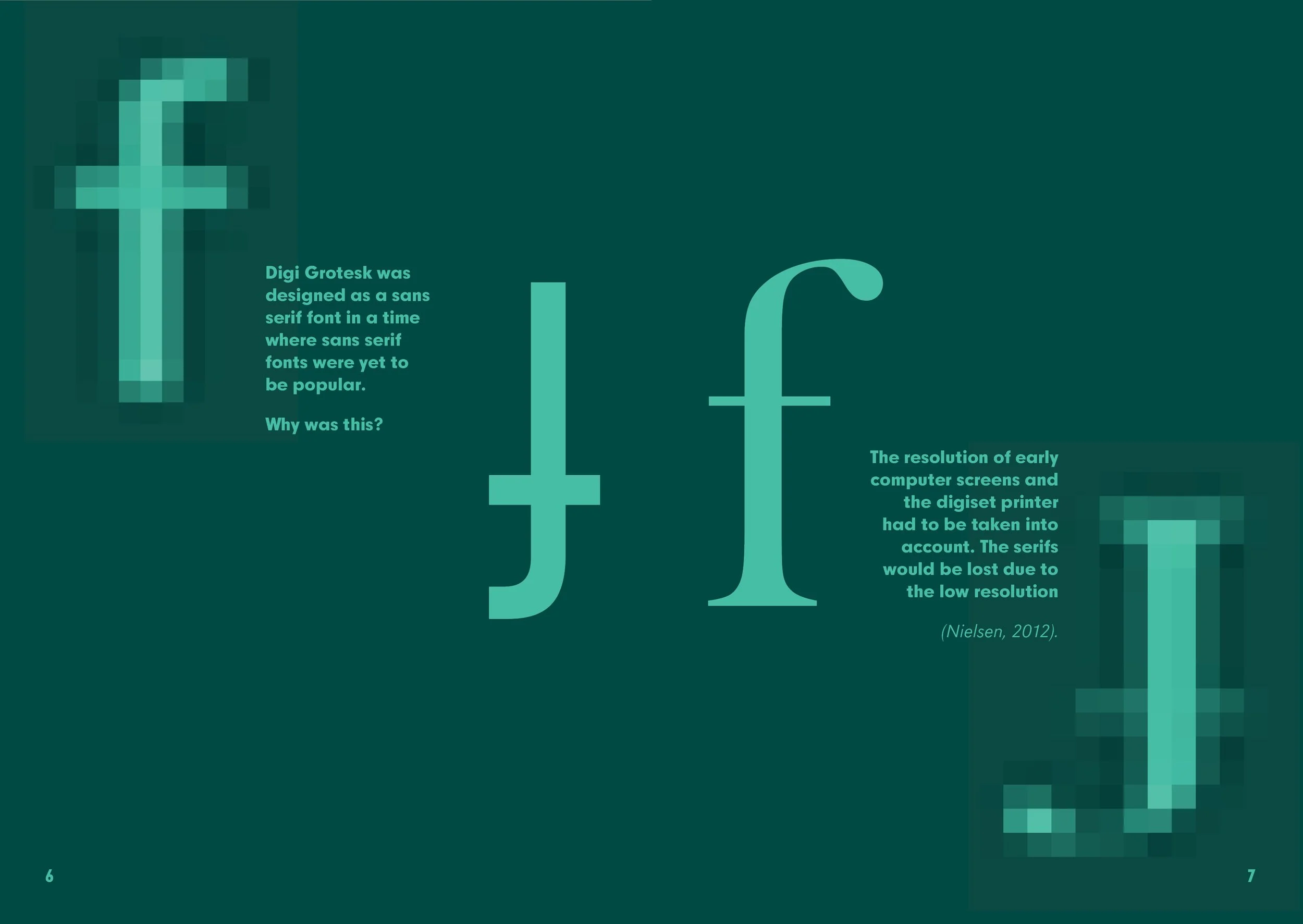
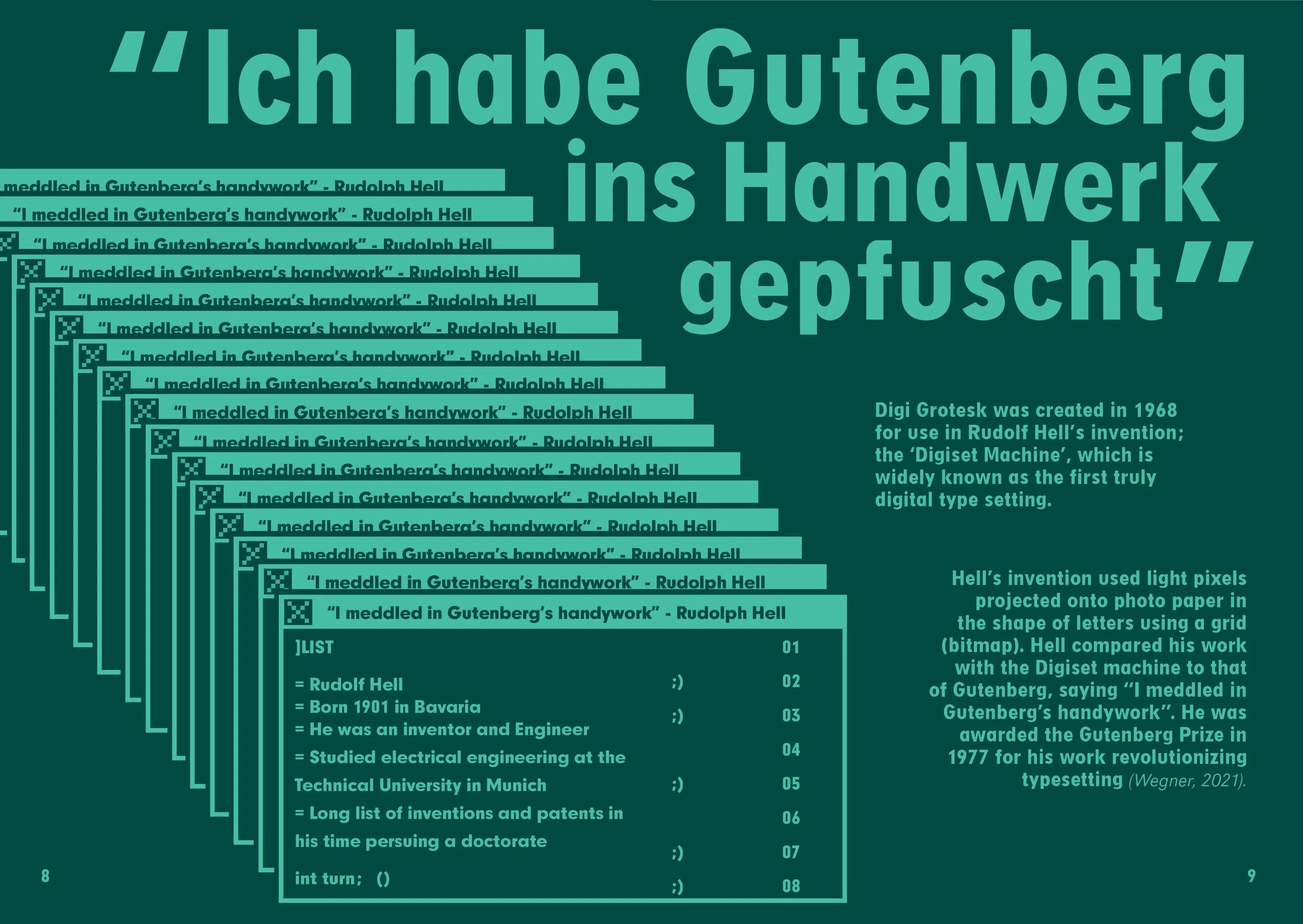
My chosen font, “Digi Grotesk”, has a fascinating story and a special place in typographic history as the first truly digital font.

This is how I told it’s story in 16 pages.

Inspiration

During this project, choosing where to draw inspiration from was crucial to staying true to the history and character of the Digi Grotesk Font.

Korean text on a beige background with a small paragraph of English and a quote at the bottom.
A old, green computer screen displaying a file management system with folders and files.
Open magazine spread showing large bold the words "Analog" and the year "1970", with smaller text describing technical details and history, on a gray background.
A promotional poster for Spruitje, a company that offers terrarium and edible microgreens. It features an abstract pattern of small black shapes resembling microgreens or sprouts, with the company name "SPRUITJE" in bold black text at the bottom.
A line of computer code written in ASCII characters on a black background.

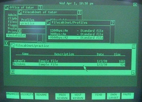
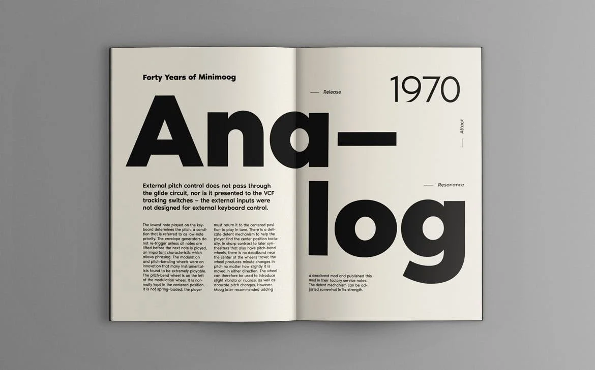
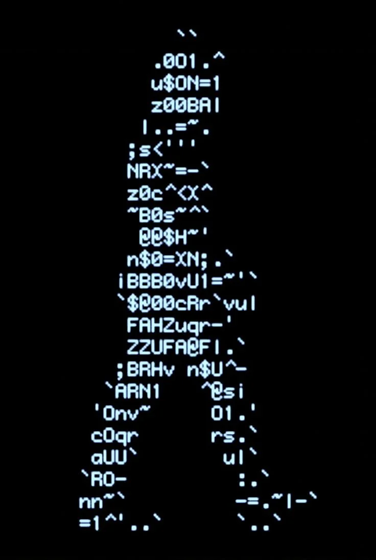
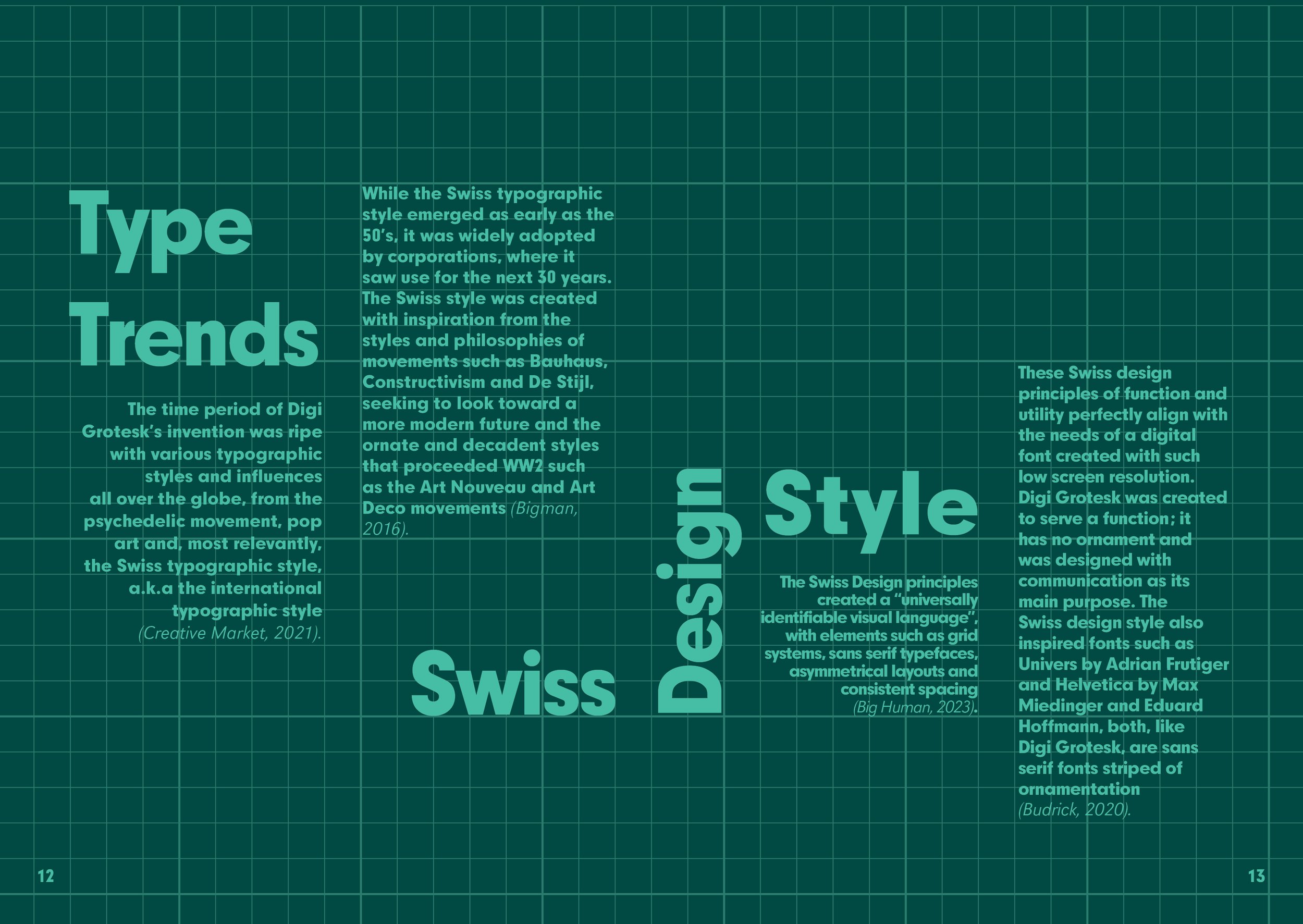
In order to do this, I leaned heavily on the evolution of digital imagery and interfaces as inspiration for the aesthetic choices made in the zine. The layout however, was closely inspired by the Swiss design style, following grid structures to evoke a more editorial feel.

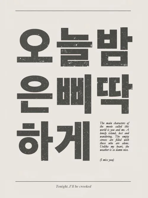
Taking inspiration from existing typographic zines and posters in a range of languages and alphabets, as well as exploring the bounds of digital art and interfaces lead me to some interesting graphics and layouts.

Final Concept

The story of “Digi Grotesk” the first truly digital font. Told over 16 pages in a typographic zine.

Open magazine or brochure with teal and dark green pages, featuring digital graphic design with pixelated numbers and small text.
Pixelated digital art with the text 'Digi Grotesk' and a cursor arrow.
Page 2 and 3 of the Digi Grotesk Typographic Zine resembling a computer terminal with binary code, file icons and a contents page.
Graphic design with large pixelated letters spelling 'e', with accompanying text about the history of digital typefaces like Digi Grotesk, and the use of bitmap format to project light pixels onto photo paper.
A digital design comparing the letter 'f' in two fonts, DigI Grotesk and a serif font, with text describing the historical reasons for their design differences.
A graphic illustration of repeated text boxes with the title 'Ich habe Gutenberg ins Handwerk gepfuscht,' referencing Rudolf Hell's creation of the digi-set machine in 1968.
A computer screen displaying multiple overlapping windows with text and images. The windows contain text files and images related to typography and printing, with some illustrations of letters and their structures. The background is teal, and the interface has icons and menu options.
Text-heavy 2 page spread about Swiss design trends, elements, and principles, laid out on a grid background, with large headings and smaller paragraphs explaining style influences and characteristics.
Screenshot of a digital document editing window with a turquoise theme, containing text, a keyboard layout, buttons, and a pop-up error message asking 'Are you sure you want to exit without saving?' with options 'Yes' and 'No'.
Mobile device screen showing a 'shutting down' message with a loading icon.