
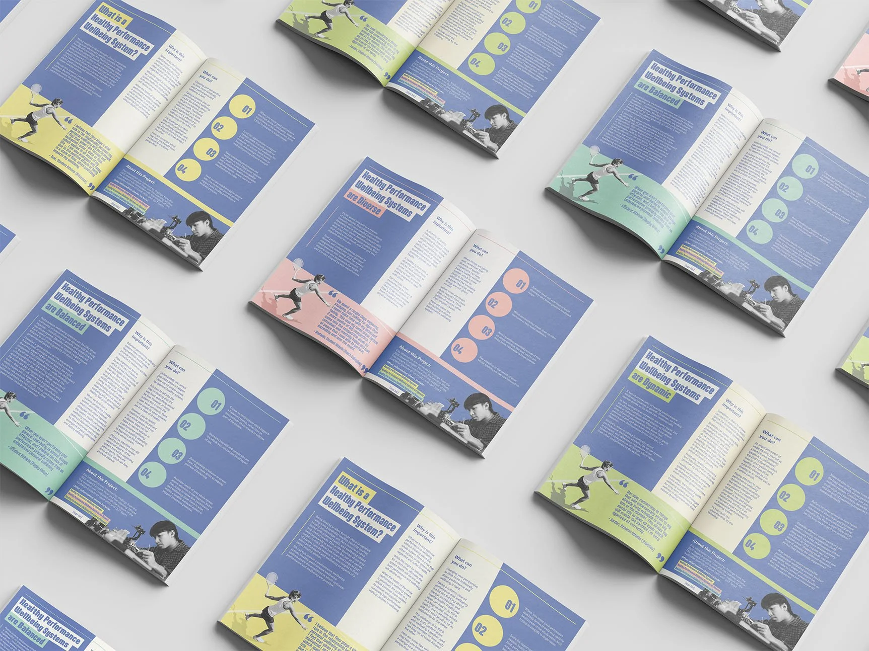
Flow and the Learning Athlete
From Ideation to Completion
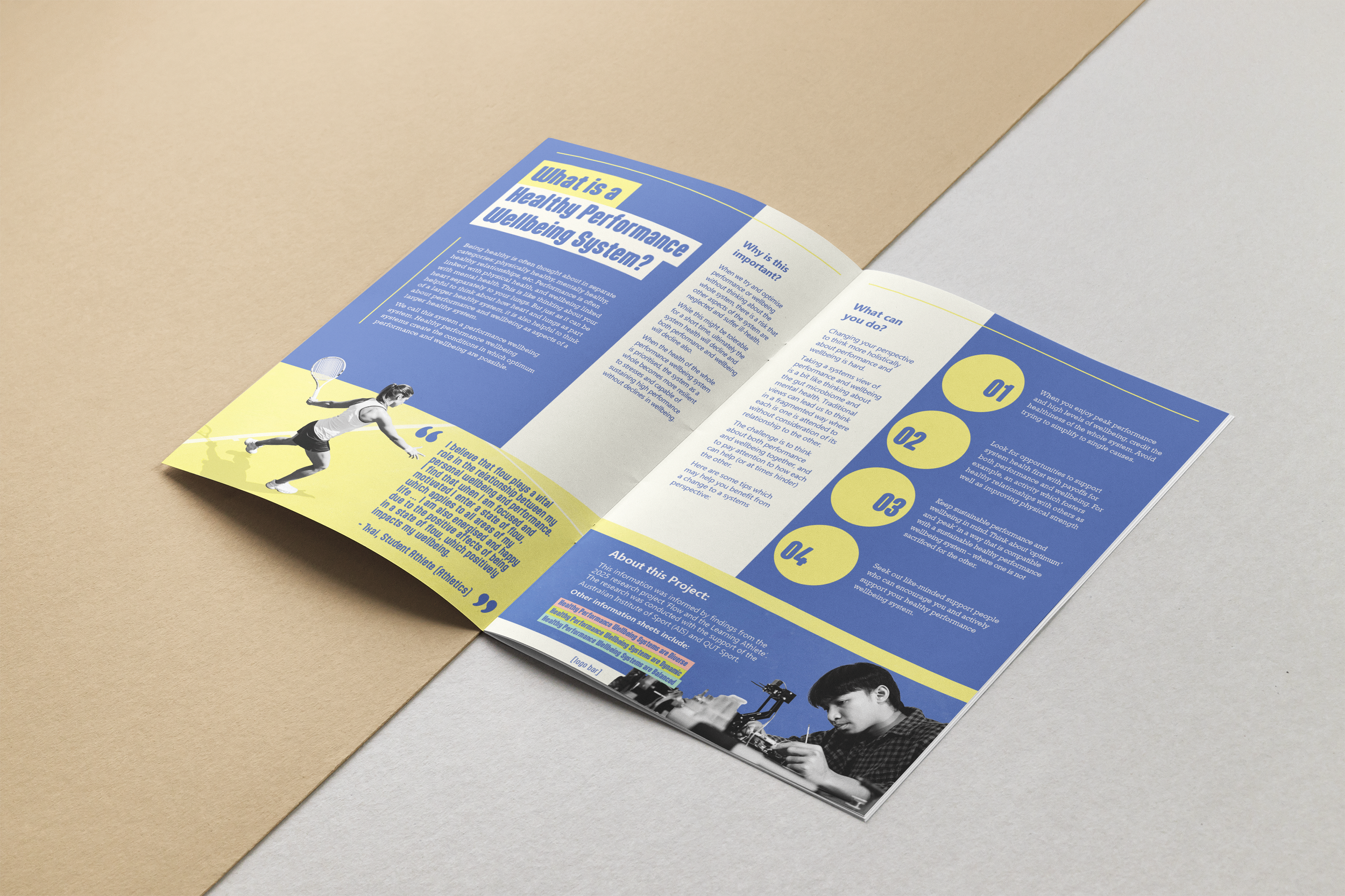
The goal for this project was simple enough; to create a series of graphic spreads to promote healthy performance and well-being systems to university students as part of a research project for the science faculty.
The design needed to toe the line between professional and contemporary to keep the young target audience engaged, and still feel like a trustworthy and reputable source of information.
The designs also needed to function as both spreads in a booklet and as double sided A4 flyers that could be distributed as pamphlets.ff
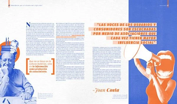
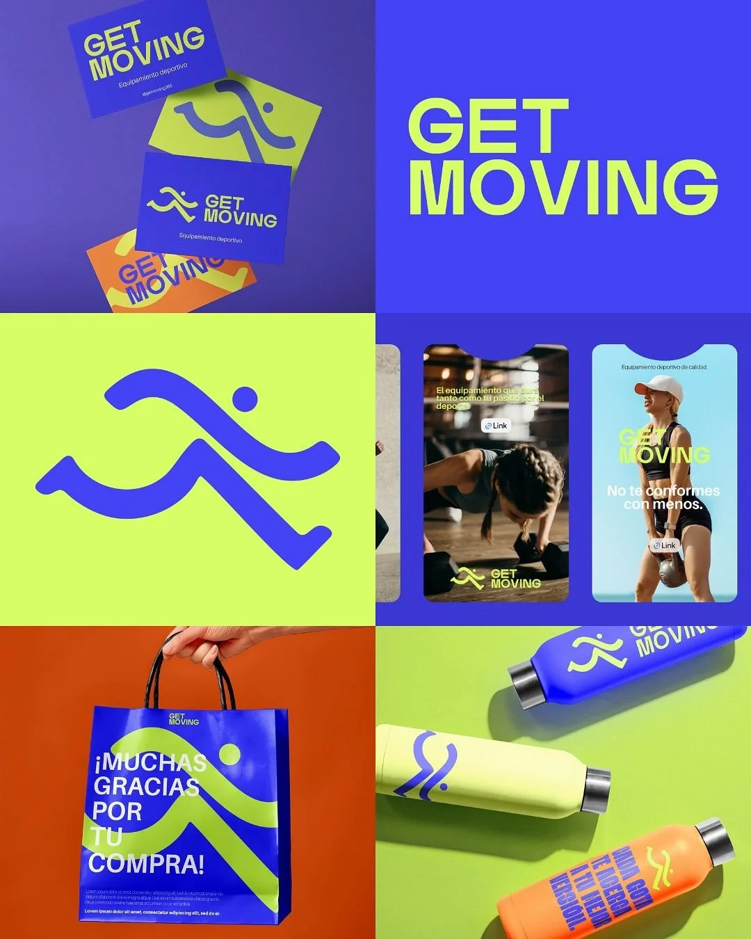
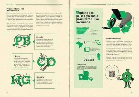
First Draft Spreads
I drew inspiration from digital copies of magazine publications that catered to either similar demographics or similar topics to that of the performance and well-being systems.
Creating 3 distinctly different options that all fit the criteria of the brief forces me to think creatively about the design problems and solutions presented to me.
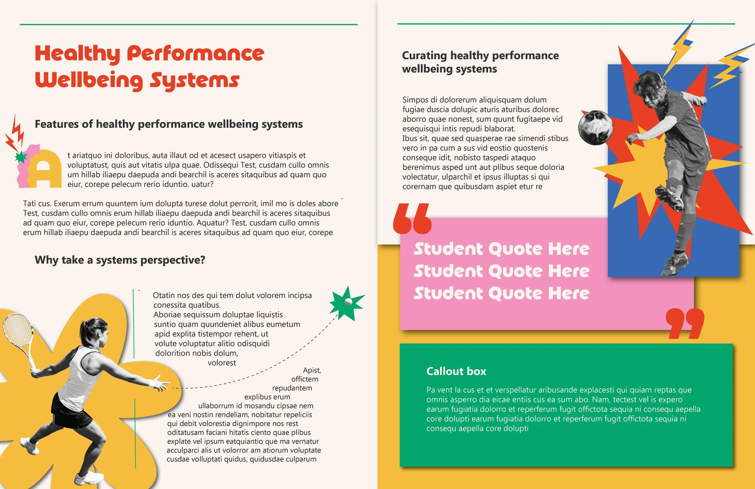
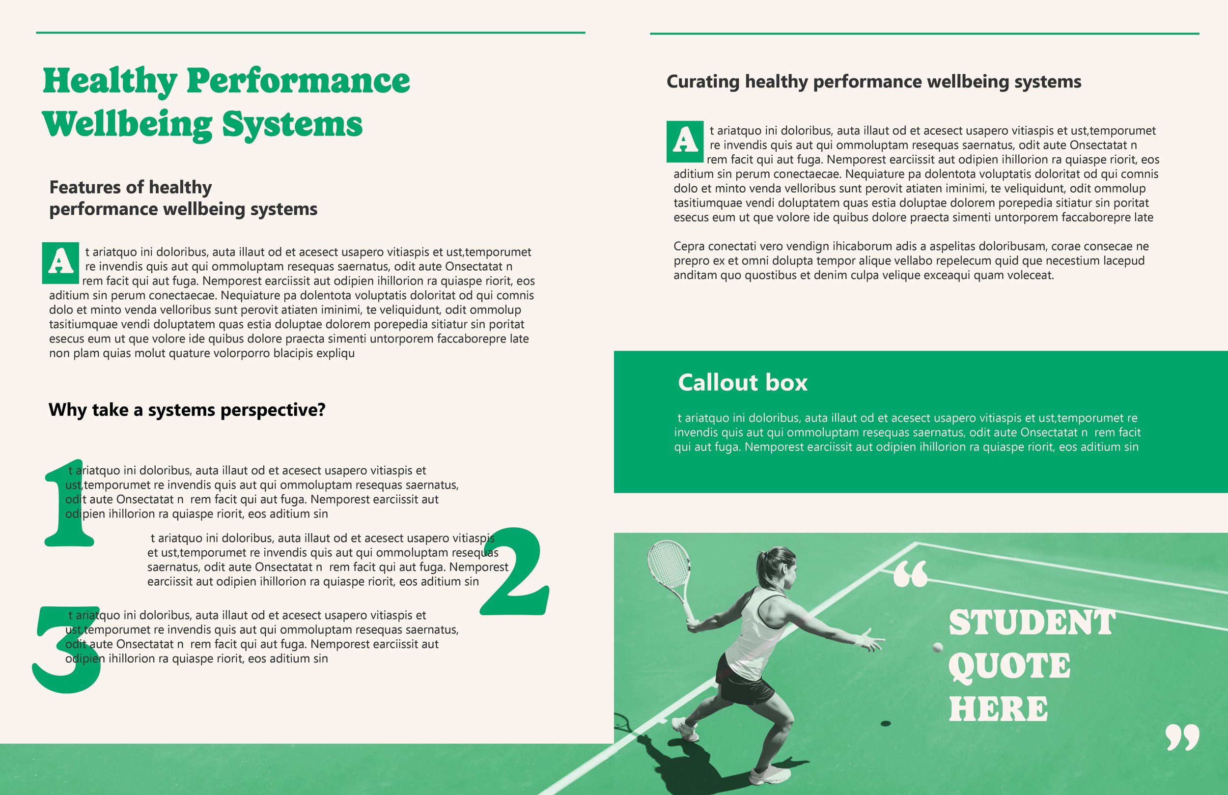
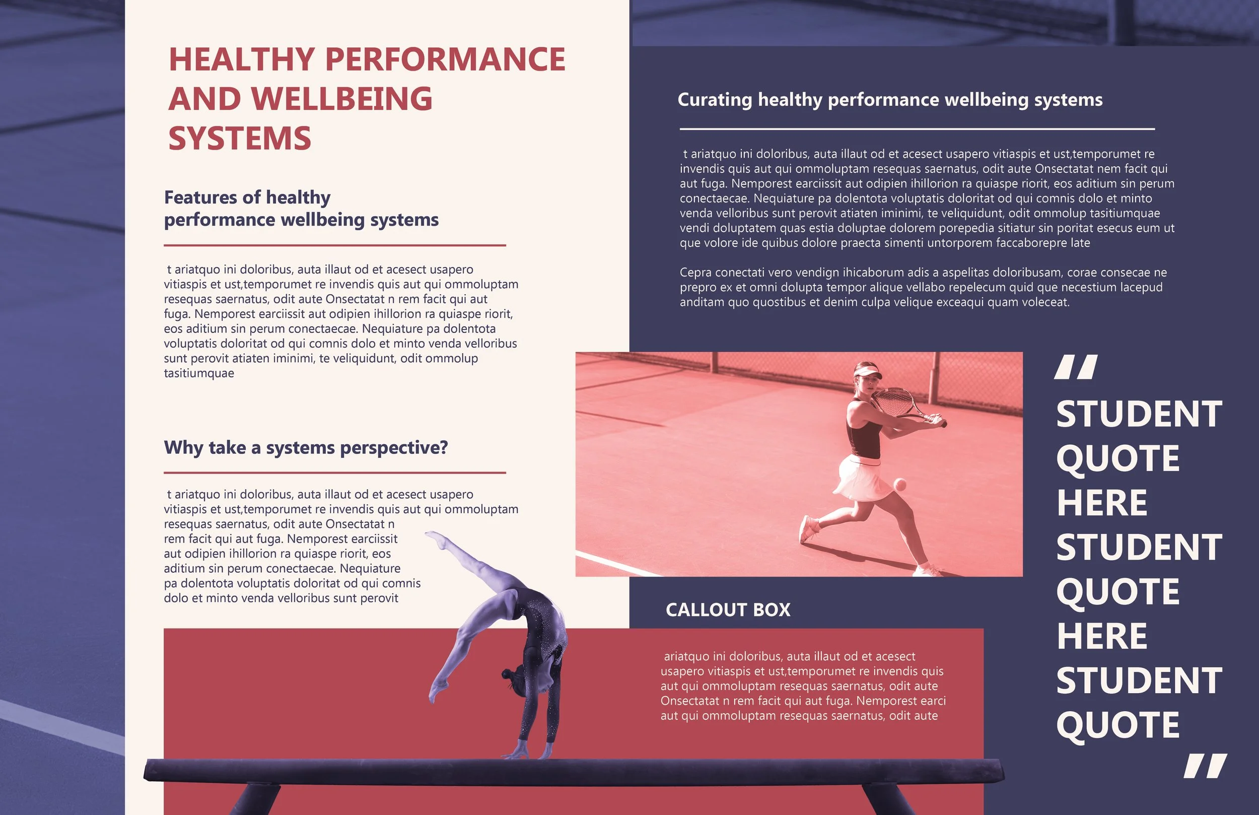
Synthesis of Ideas
Receiving from the first round of drafts and synthesizing and ideating further, I came to the point that the bones of the design are strong, and I could begin to adjust colour and typesetting more specifically.
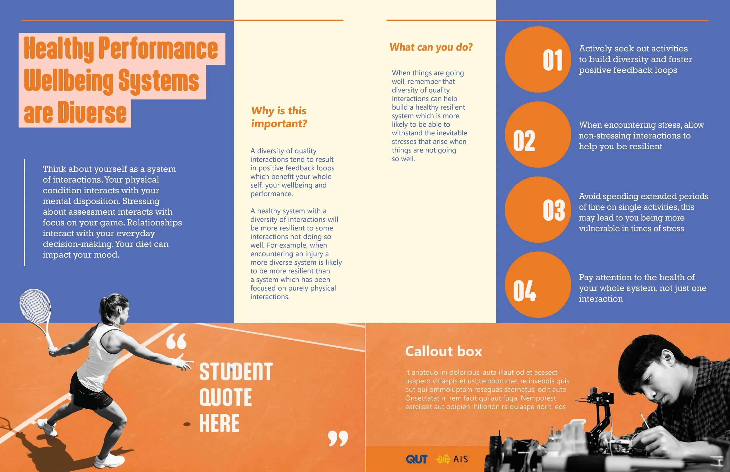
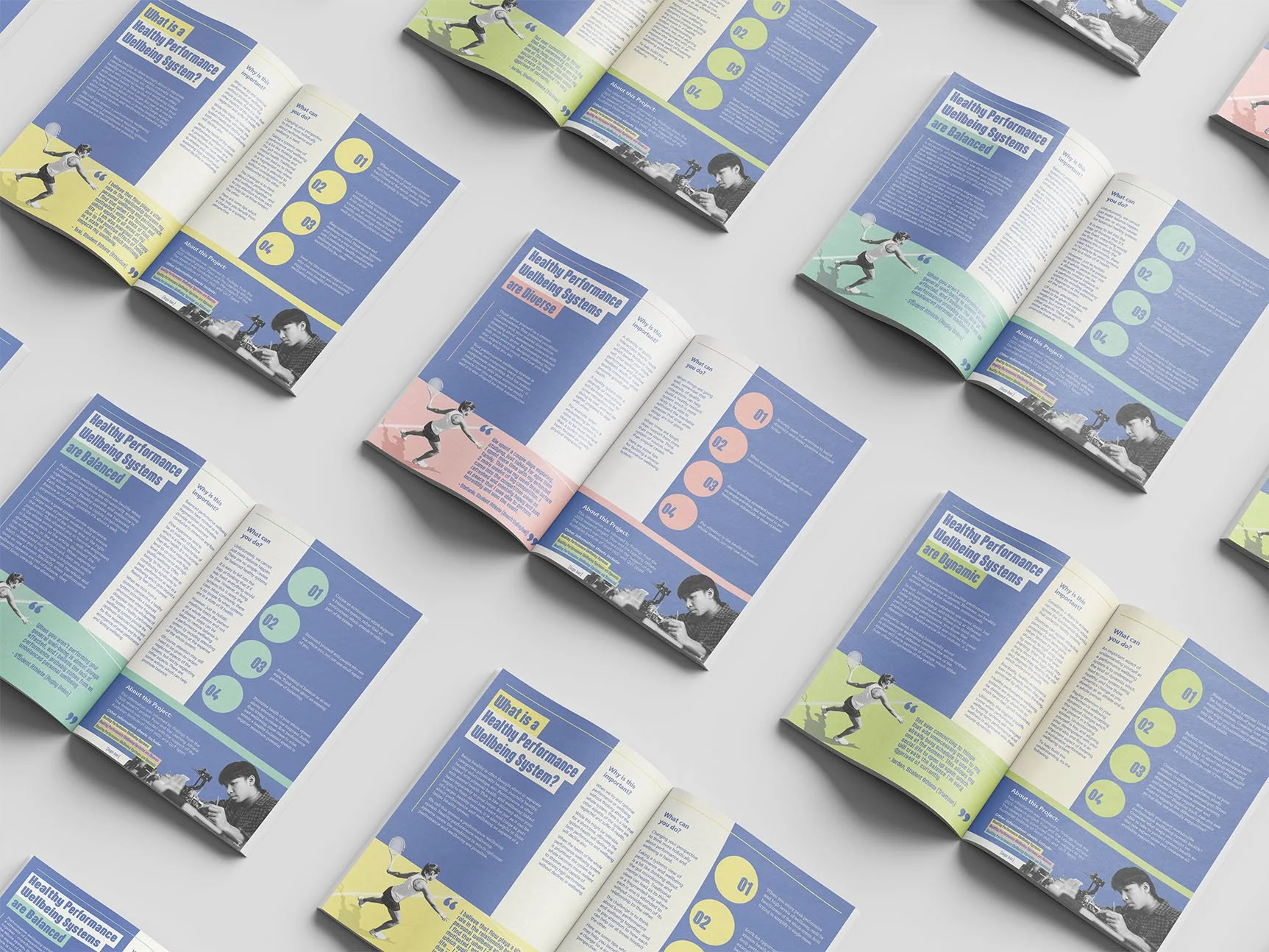
Final Concept
In the final stretch of design, making sure the colour schemes meet the WCAG accessibility guidelines, ensuring a good hierarchy flow and making final tweaks were key.
Because this was concept work, I only had access to stock photography.
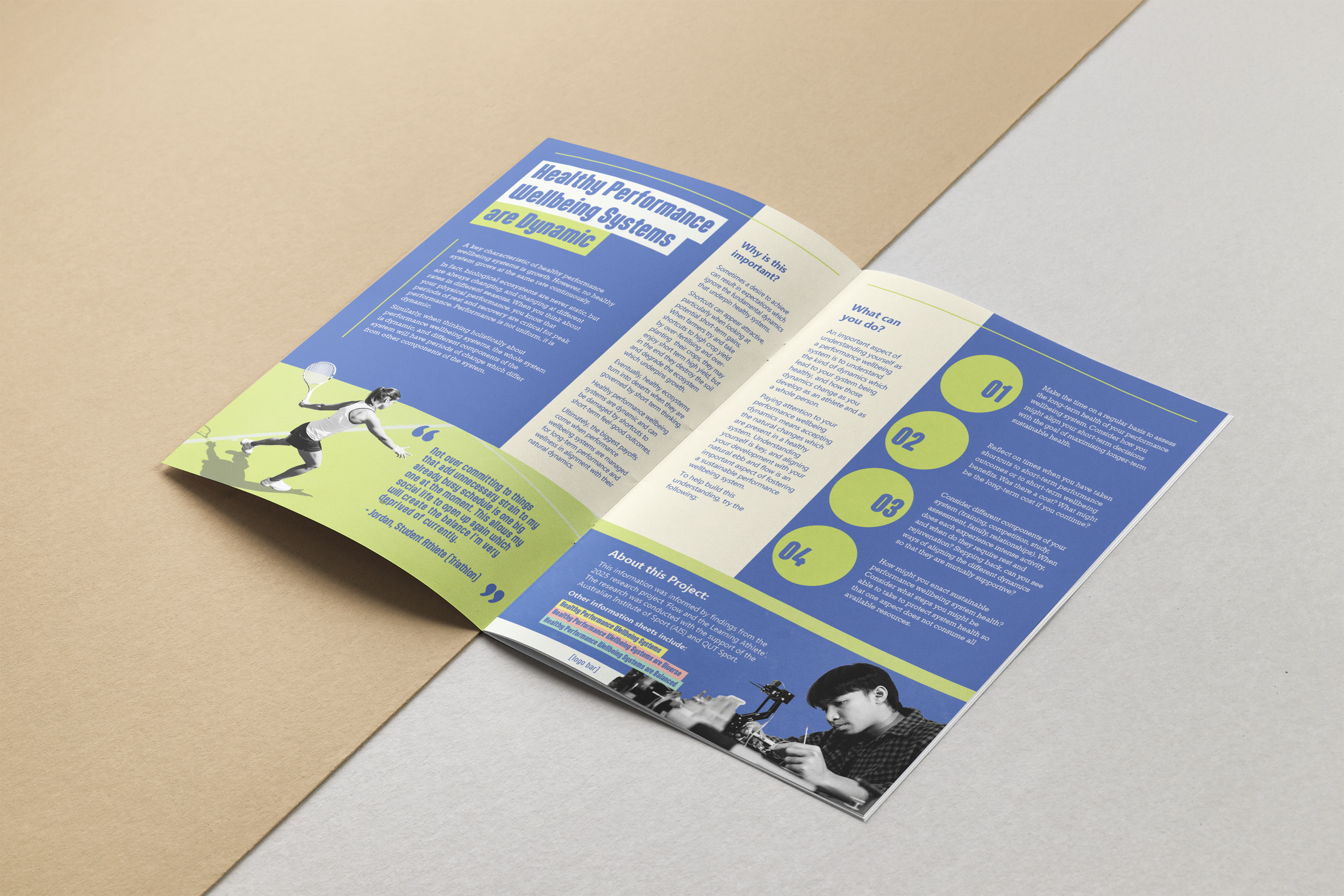
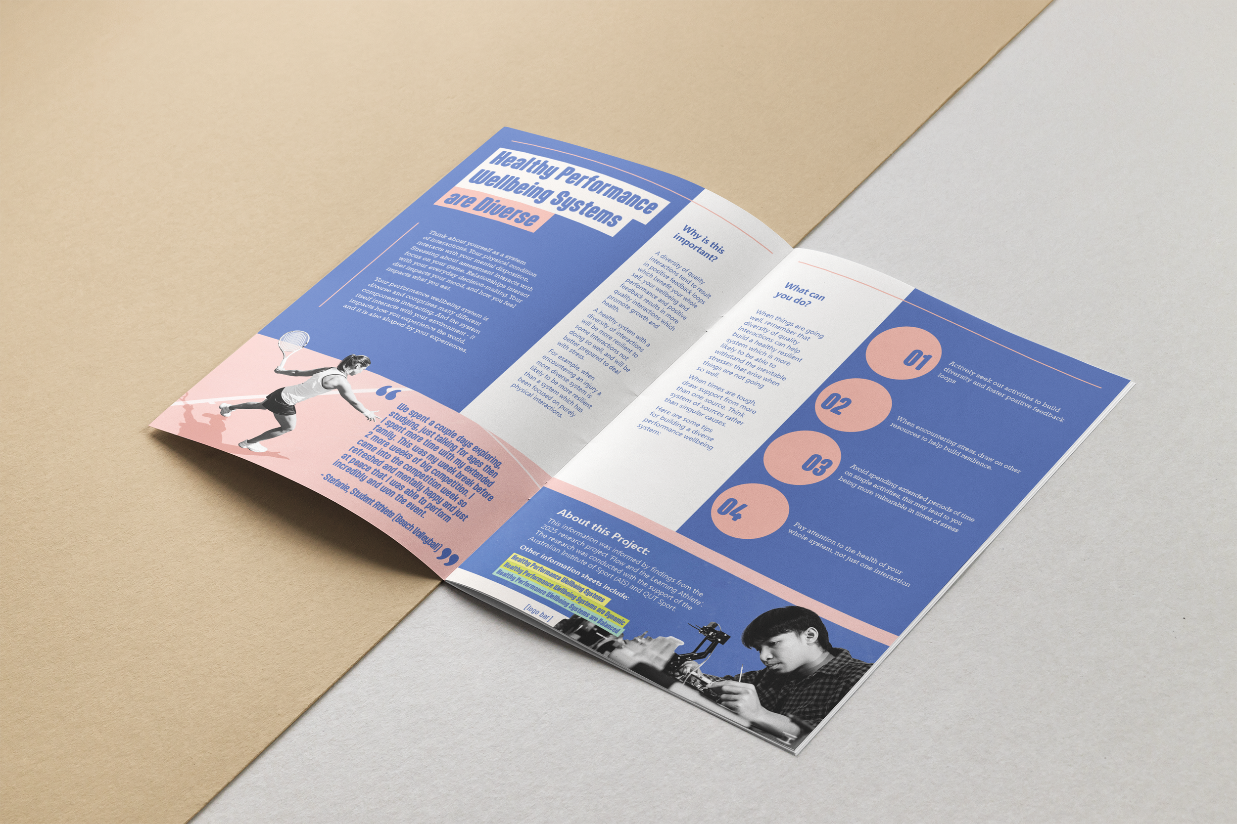
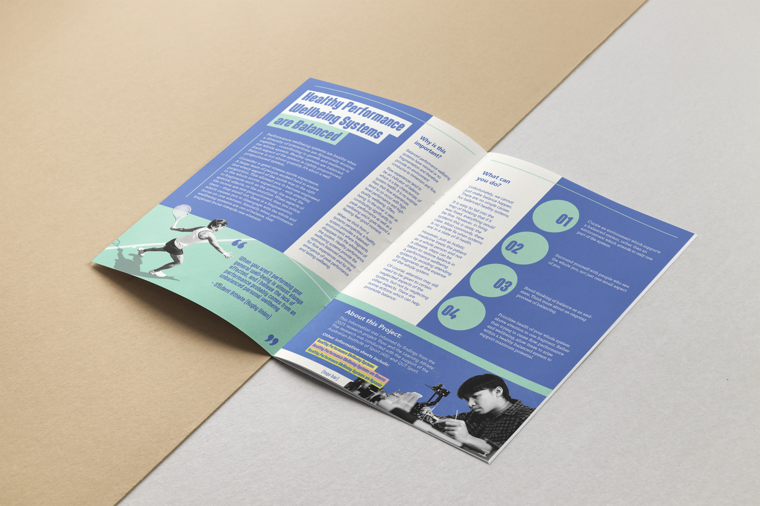
Wrap Up
This project was amazing to be involved with, I was given so much freedom with the creative direction and I really enjoyed watching it come to life. This was also an excellent exercise in typesetting with provided copy, and template creation.