QUT Design Club
Design Process:
From Ideation to Completion
This project came in the form of a design competition, asking participants across QUT’s school of design to re-imagine the QUT design club (at the time QUT design collective) logo.
The logo should reflect the clubs values of creativity, connectivity and community, and use their existing brand colours of red, yellow and blue.
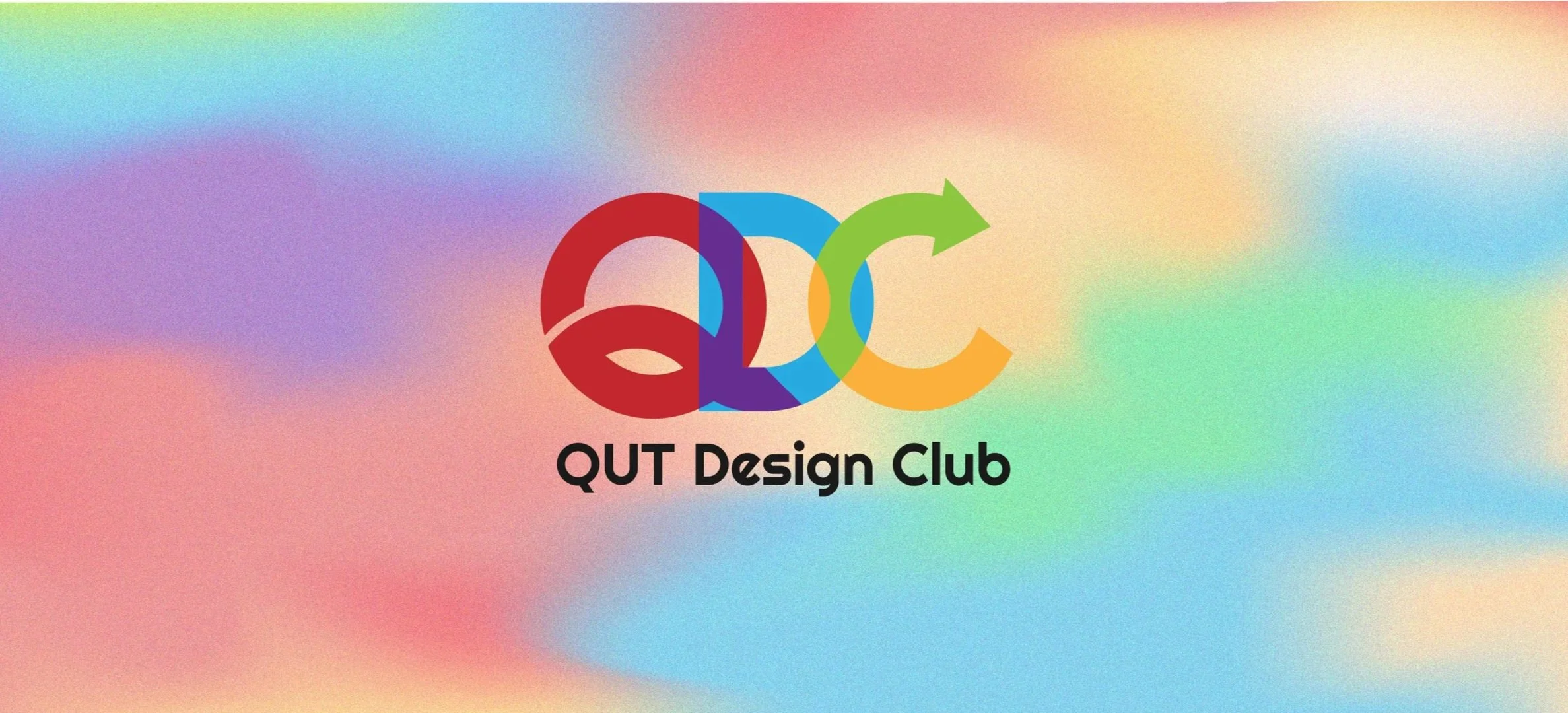
In addition to these stipulations, I felt it was important that the logo should work in the small scale of social media profile pictures, due to the integral part social media plays in the clubs campus presence.
Inspiration
The beginning of the process, much like many others, was to brainstorm what I associated with the club, and to translate that meaning into a visual language for the logo.

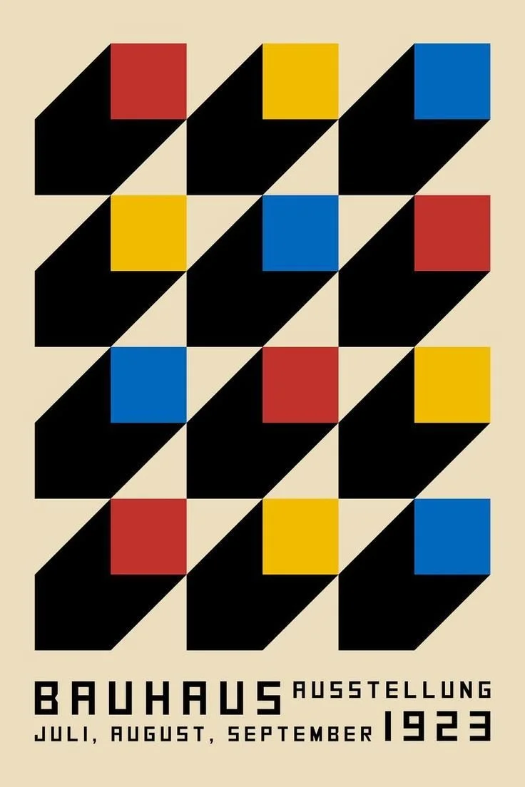
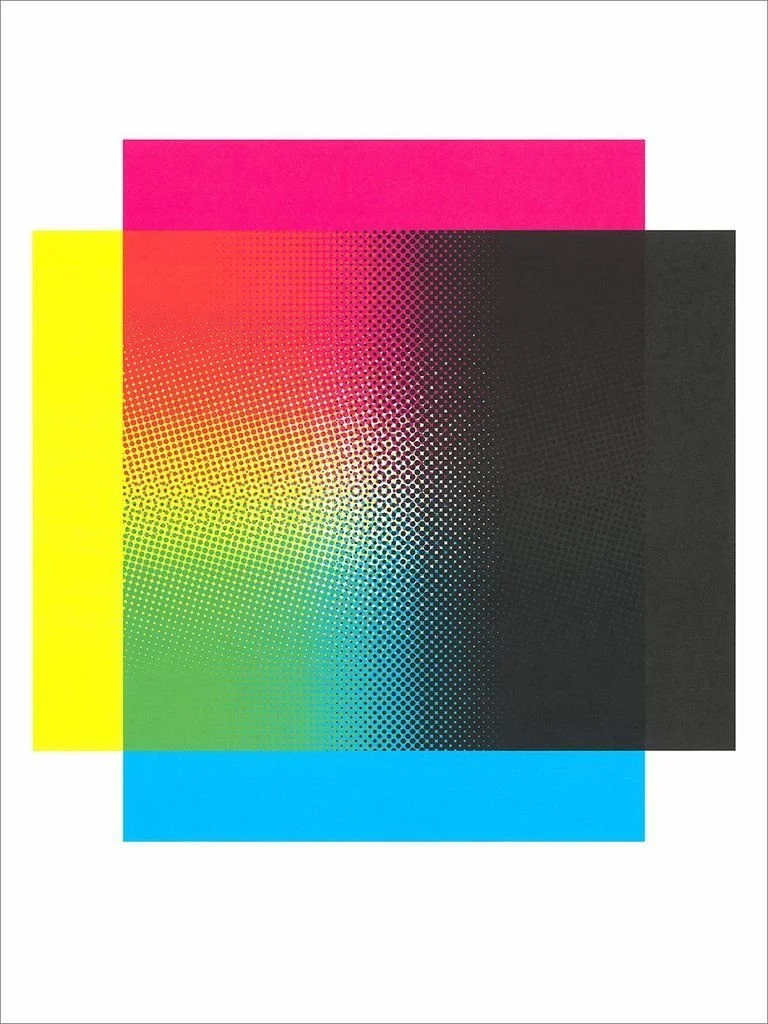
In this case, i was inspired by the Bauhaus movement. This movement with its structured and geometric approach to design was influential across design disciplines, just as the QUT design club is a space for interdisciplinary relationships to flourish.
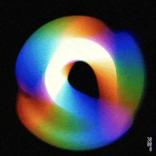
I also found the way colours interact with eachother to be an interesting visual metaphor for how new and beautiful things are created when designers from different disciplines work together.
Concept to solution
My initial submission was accepted as the winner of the design competition, however a few tweaks were still needed.
The “QUT design collective” was now the “QUT design club” and they requested some small changes to represent this.
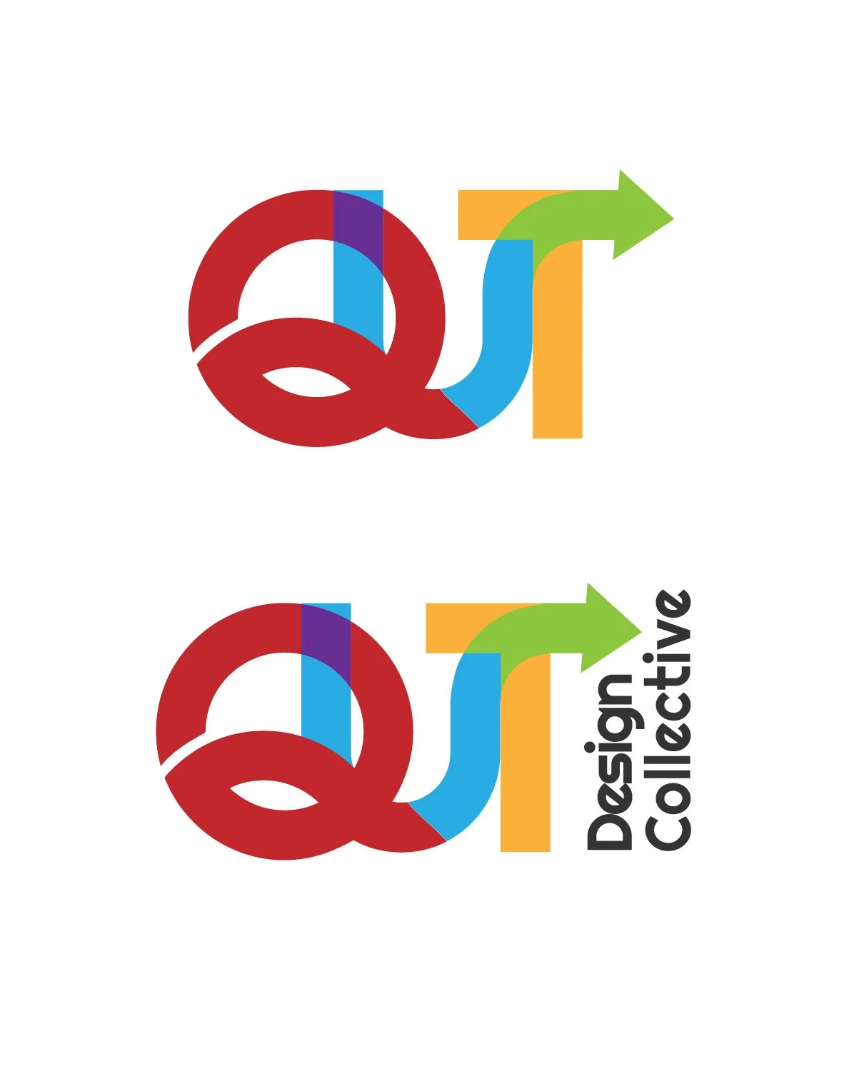
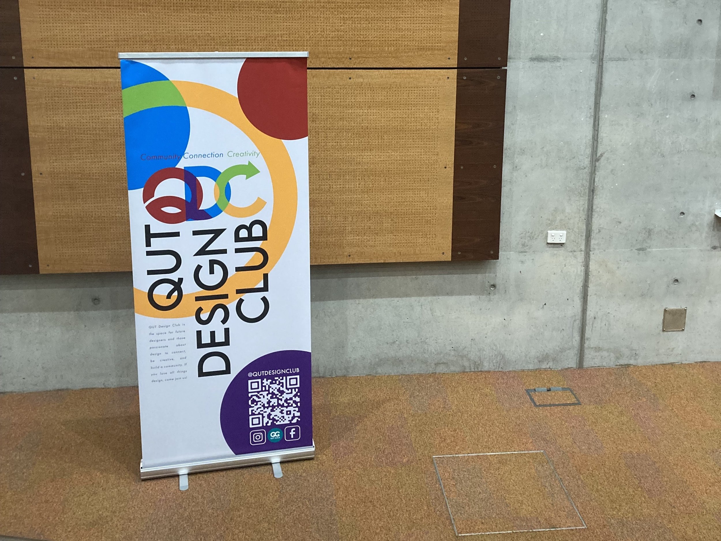
Final Concept
After some final tweaks, the QUT Design Club logo was ready to be used.