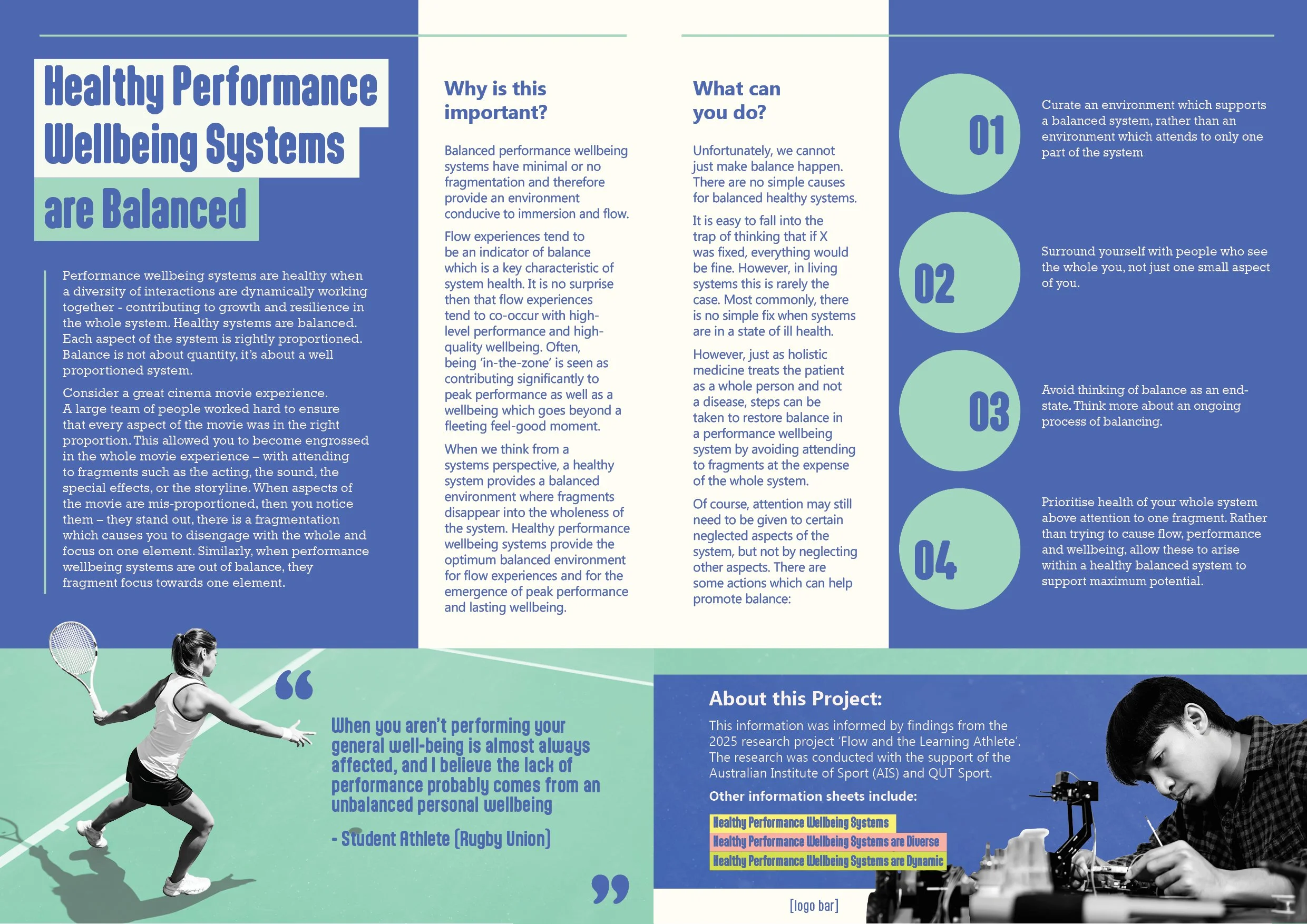
QUT Performance and Wellbeing Systems

Design Process:

From Ideation to Completion

The goal for this project was simple enough; to create a series of graphic spreads to promote healthy performance and wellbeing systems to university students.

The design should toe the line between professional and contemporary to keep the young target audience engaged, and still feel like a trustworthy and reputable source of information.

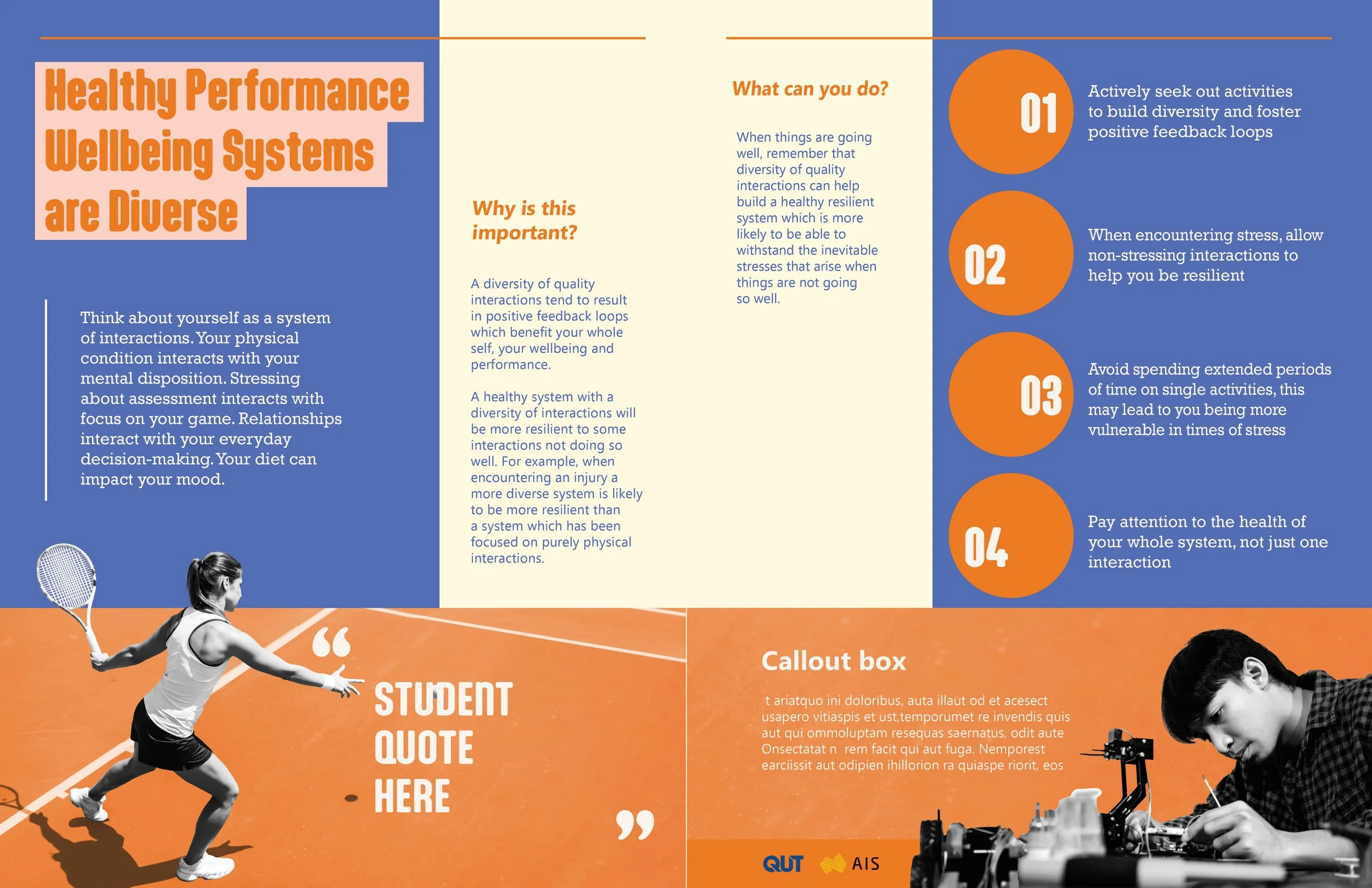
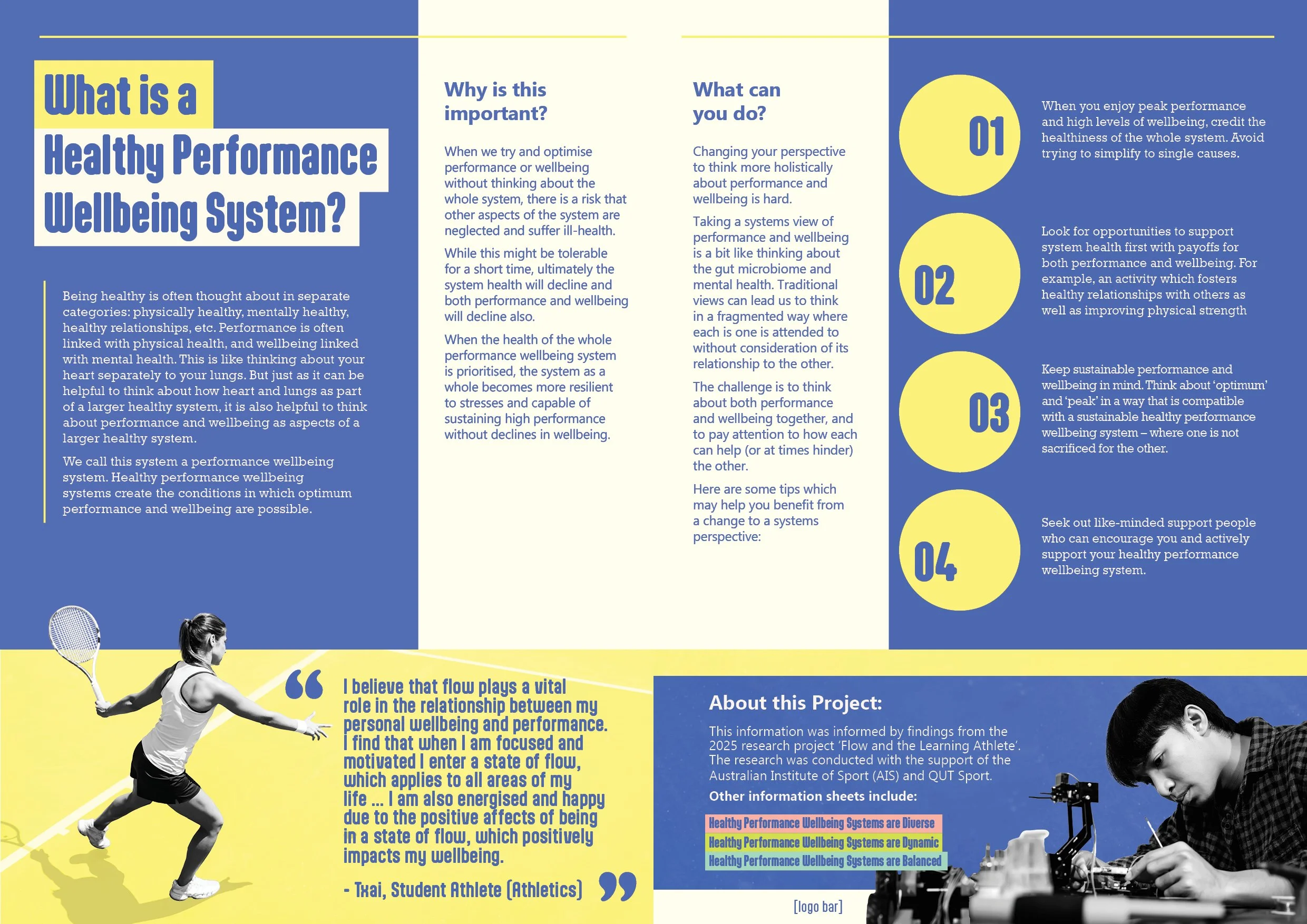
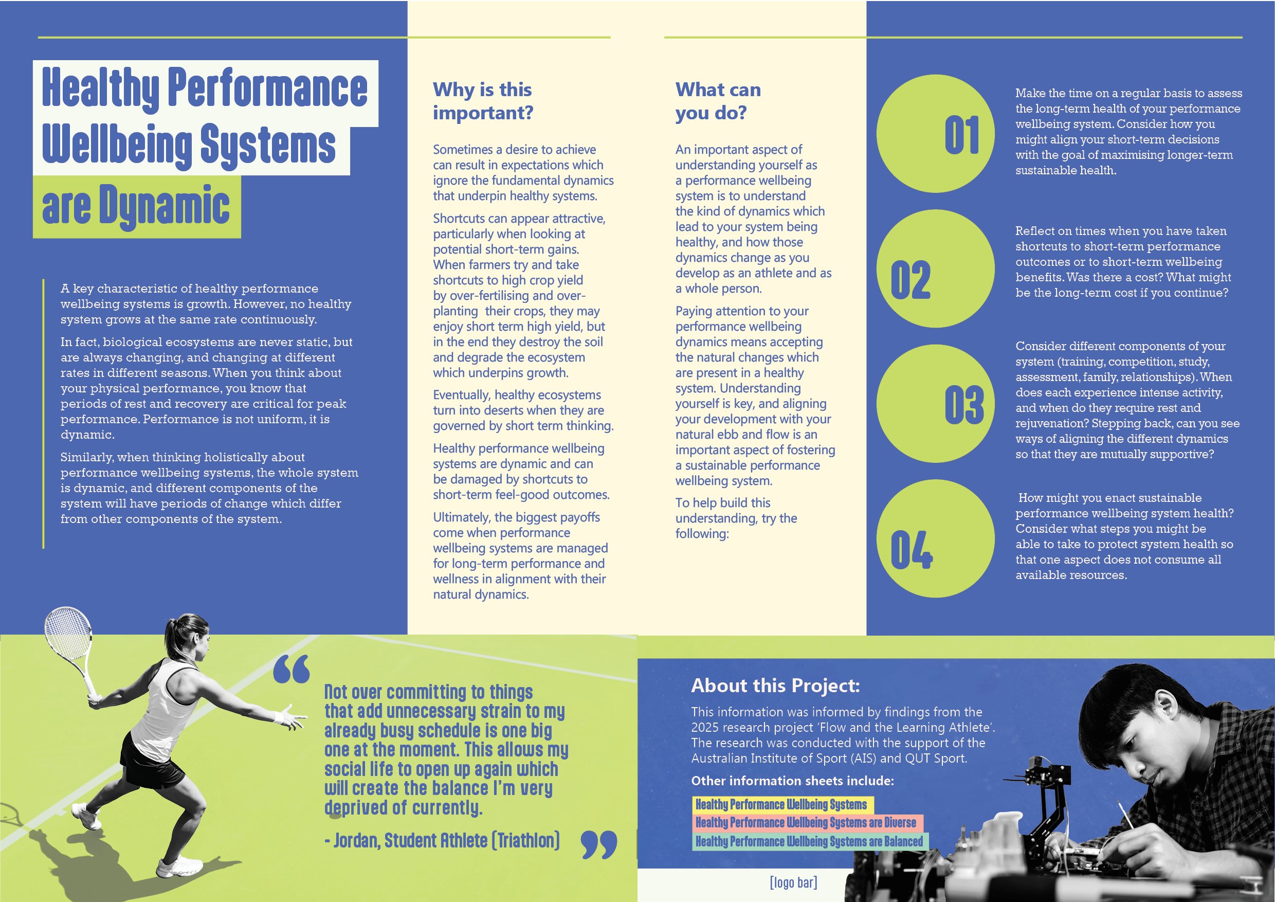
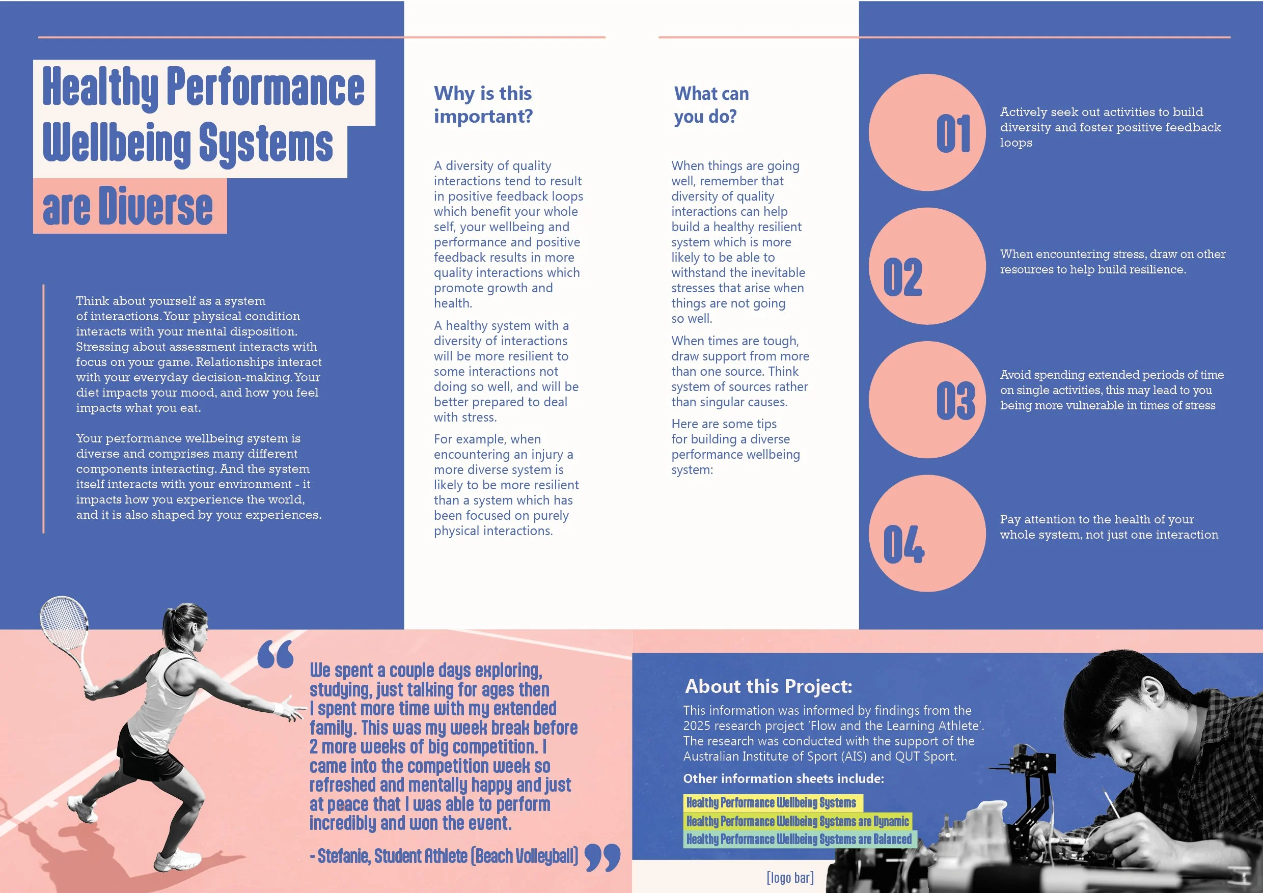
The spreads themselves should also function as double sided A4 flyers to be distributed.ff
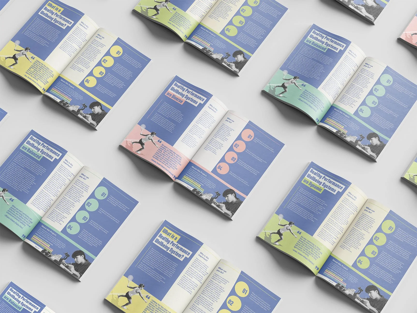
A colorful promotional flyer or brochure for healthy performance wellbeing systems with sections of text, a photo of a woman playing tennis, a graphic of a boy kicking a soccer ball with comic-style starburst backgrounds, and a callout box with placeholder text.
An monochrome informational flyer titled 'Healthy Performance Wellbeing Systems' with sections of text, a green callout box, and a black and white image of a woman playing tennis.
A flyer about healthy performance and wellbeing systems. It includes sections of text, a photo of a girl playing tennis on a court, a gymnast performing a handstand on a balance beam, and a placeholder for a student quote. The layout has a cream, navy, and red color scheme with bold headings and a callout box.

First Draft Spreads

Creating 3 distinctly different options that all fit the criteria of the brief forces me to think creatively about the design problems and solutions presented to me.

I drew inspiration from digital copies of magazine publications that catered to either similar demographics or similar topics to that of the performance and wellbeing systems.

In the first phase of design, creating clear criteria for a successful design according to the brief makes the process easier.
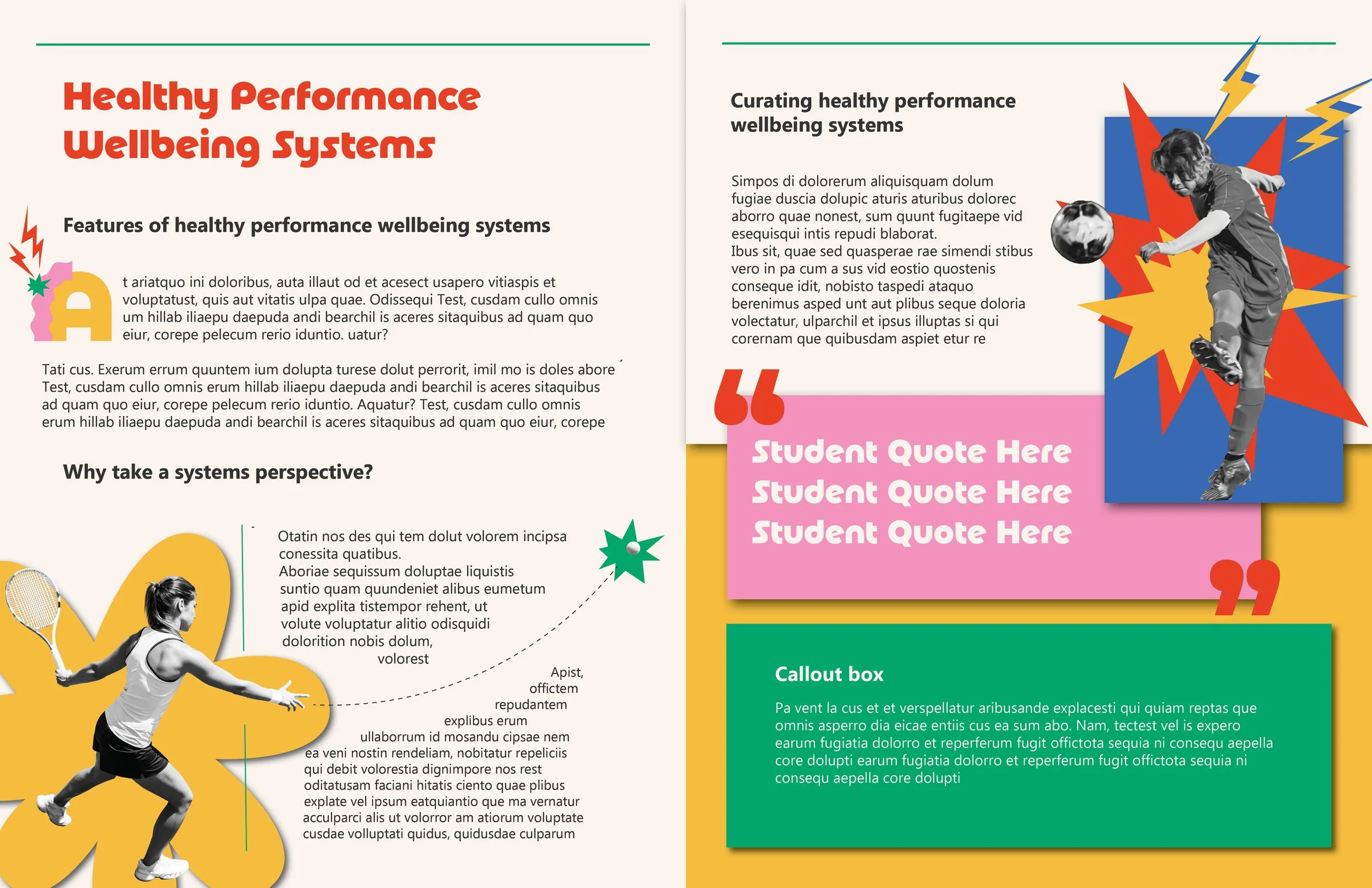
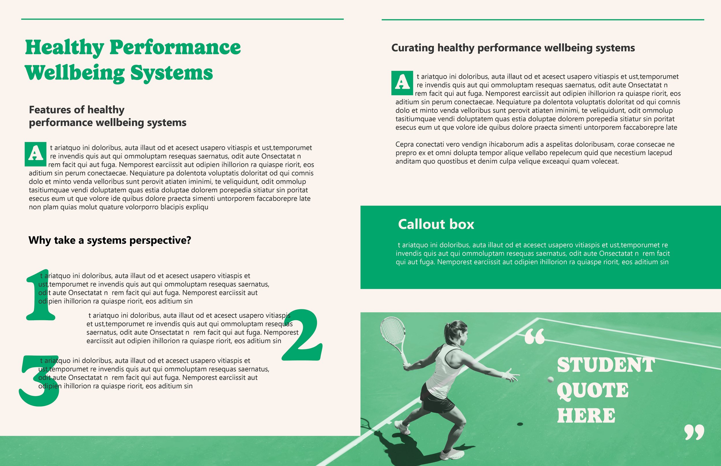
Synthesis of Ideas

Receiving from the first round of drafts and synthesizing and ideating further, we come to the point that the bones of the design are strong, and I can begin to adjust colour and typesetting more specifically.

A colorful informational flyer titled 'Healthy Performance Wellbeing Systems are Diverse.' The poster also includes images of a female tennis player and a person working on electronic equipment.

Fine tuning colour and typesetting is very important to the hierarchy of a document. While the majority of the hierarchy is informed by the layout, these aspects play important roles too.
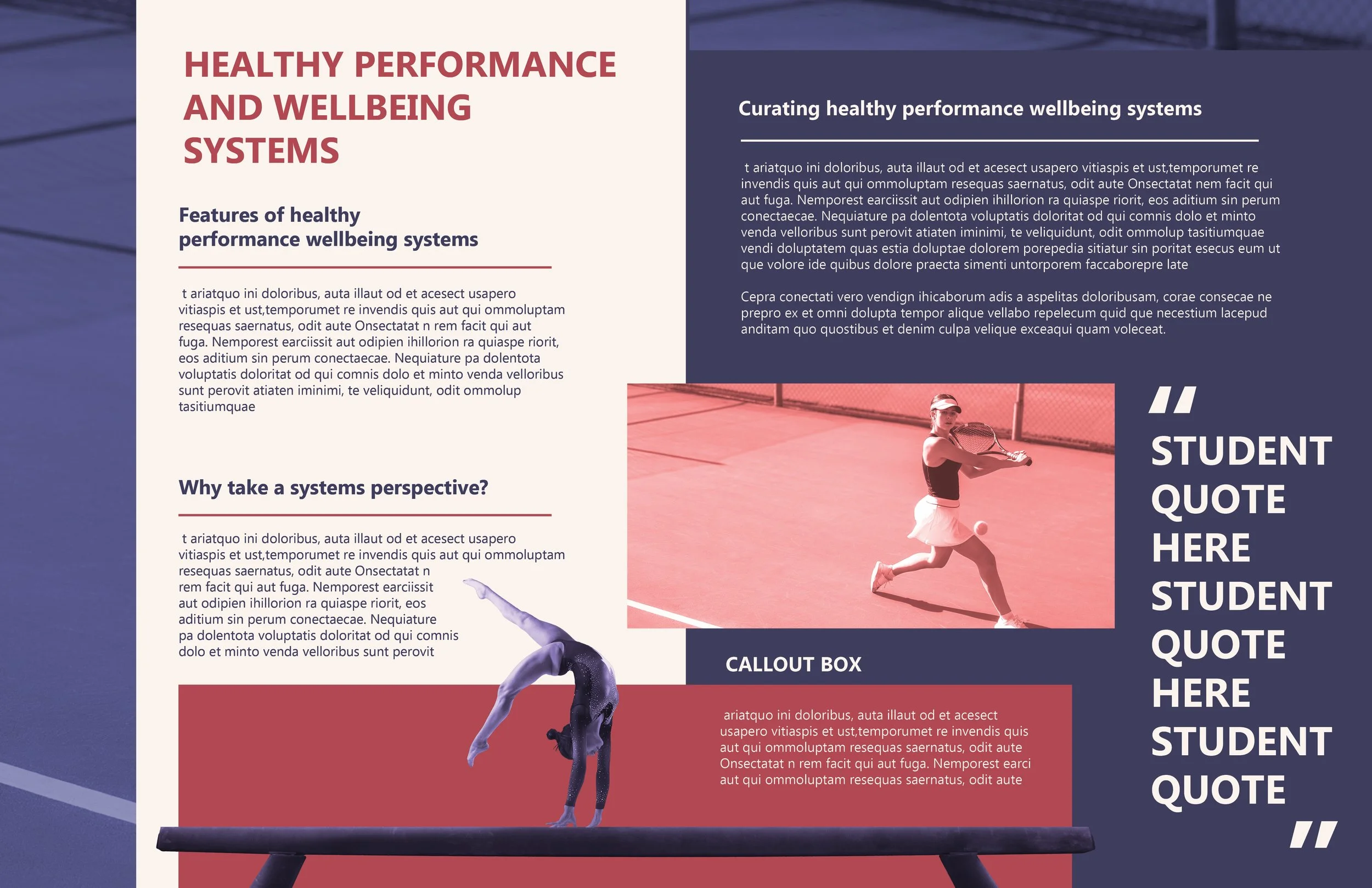
Final Concept

In the final stretch of design, making sure the colour schemes meet the WCAG accessibility guidelines, ensuring a good hierarchy flow and making final tweaks are key.

Informational fly titled "What is a Healthy Performance Wellbeing System?" with sections explaining its importance, actions to take, and tips. Includes images of a female tennis player in action and a male scientist working with laboratory equipment.
An informational flyer about healthy performance wellbeing systems, featuring sections on the importance, actions, components, and sustainable practices, with images of a female athlete and a person working in a laboratory.
Informational flyer about healthy performance wellbeing systems being diverse, featuring sections on importance, actions, tips, and project details, with images of a woman playing tennis and a young man working on a project.
An informational infographic titled 'Healthy Performance Wellbeing Systems are Balanced' featuring text, graphics, and photos. The right side has a graphic of a young girl playing tennis, and the bottom right corner shows a young boy working with a microscope.

Because this was concept work, I only had access to stock photography.